Brand identity

Case Study: Happy chocolate – branding from scratch!
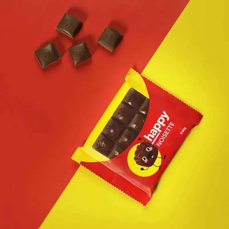
All about Happy: Vibrant and HAPPY experience. Happy was a new chocolate in the palette ov Vitaminka’s products. The chocolate comes in 4 different tastes and two types of packages, a smaller one (xx gr) and an XXL one (xx gr.)
Division’s job was to create the whole story and branding around Happy and positioning it among the target audience.

As you may know… the target audience was chocolate lovers, meaning: ALMOST EVERYONE.

The Idea

Let’s create the most cheerful new brand of chocolatesThe design was based on three principles:

Joyful
Playful
Authentic

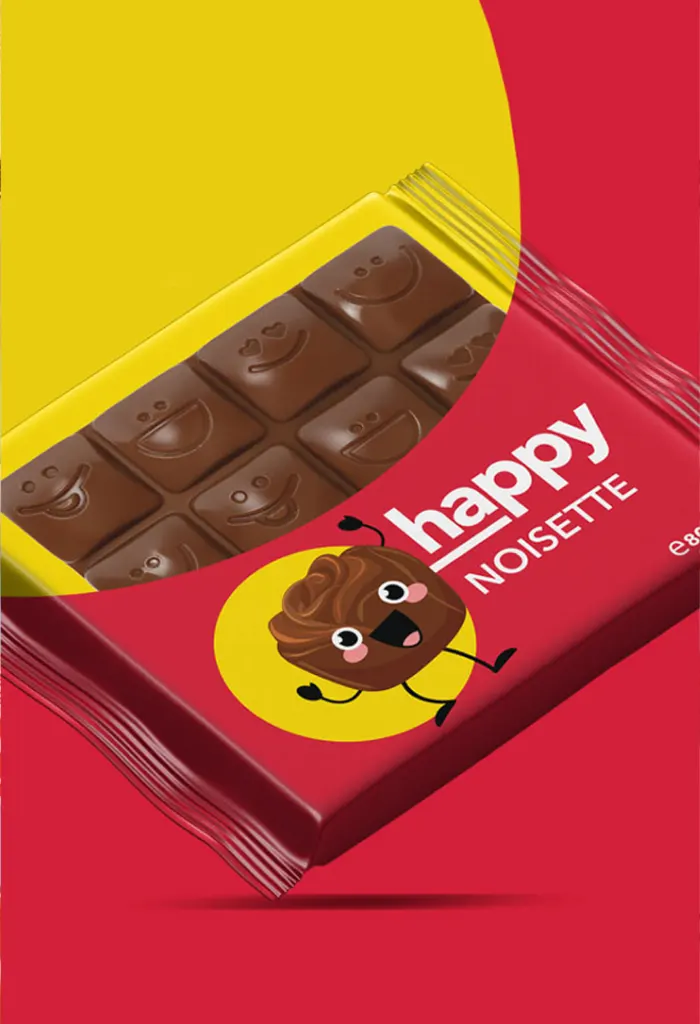
And in order to deliver this we created a clan clear and simple LOGO with sole focus on typography. This made the name of the brand stand out among the competition on the market shelves.
The authenticity and playfulness was achieved with the HAPPY color palette.
The pallets chosen for the packaging combines a range of vibrant and captivating pantone colours evoking a sense of delight and satisfaction.
Take a look at this colours, they already make you happy even before you try this tasty chocolate.


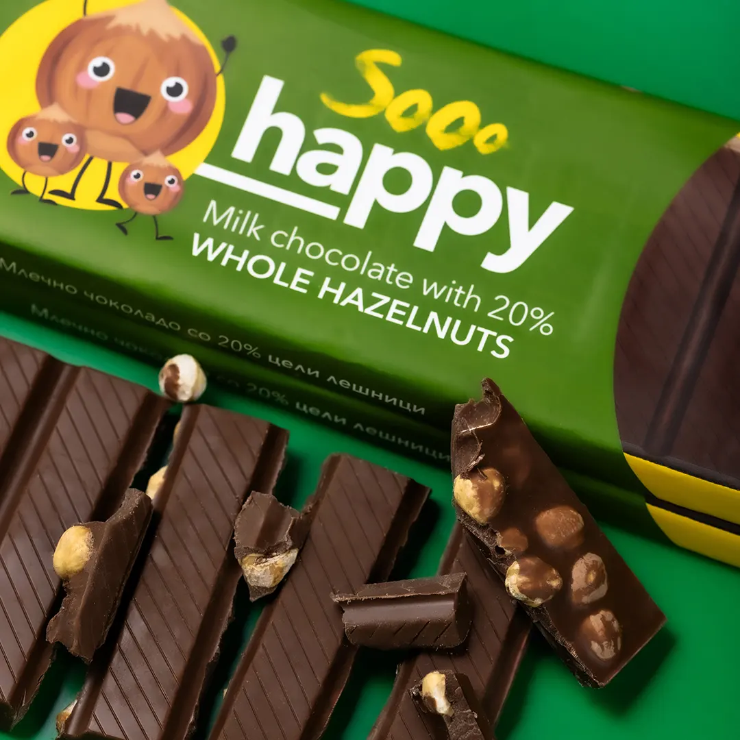
Chocolate makes me Soo Happy

Photography & videoIn order to achieve deliciousness and irresistible appeal on all channels where Happy chocolate would appear, we set out some brand guidelines for photography and video.

We decided to capture the texture and the unique characteristics of the chocolate through the camera lens, and use this in combination with typography to convey some messages and brand values.